Lindemann Sans is an immediately inviting typeface with a pleasing distinct visual voice grounded by geometry and golden proportions. This modern geometric san serif typeface serves the interpretive needs of modern design through its legibility. This legibility is achieved through proportional balance of each letter based on the golden ratio, open counters, high x-height and wider individual shapes. In addition, a high level of legibility is arrived through distinctive glyphs like a, e, @, and f, which are engaging and add to Lindemann Sans visual voice.
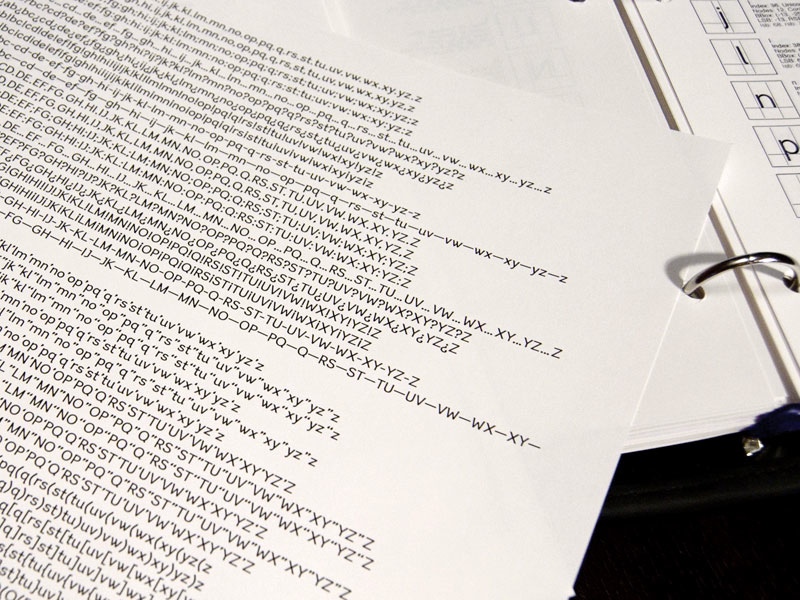
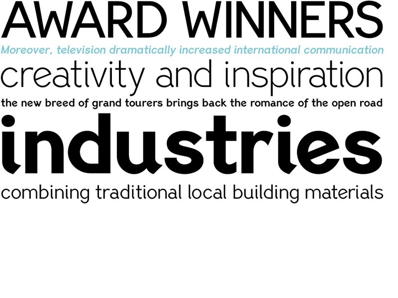
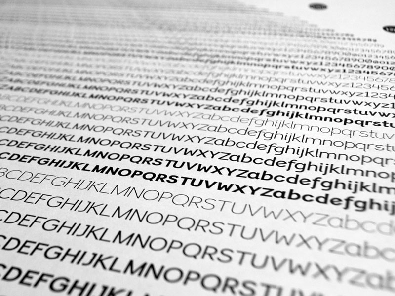
Being a modern, spirited, tech-savvy typeface, Lindemann Sans has many of the features demanded by today’s designers. These features include 800 characters within each font, many ligatures, full numbers sets, small caps, alternative characters and other niceties found in opentype fonts. Due to Lindemann Sans high legibility, geometric sans tradition, and a large feature set list, it is a very versatile typeface and can be used in replacement of the more commonly used sans.
Specifically, Lindemann Sans can be used by technology corporations, architectural firms in their supporting materials, in magazines as headers and key-points, as the typeface for professional keynotes, for the package design industry as a whole, in automotive concept projects, and for cosmetic branding for high class hair products. With its inviting nature it may also be used for liberal arts promotional materials. In addition, this typeface can be used by green industries because of its nature derived proportions.
Each style and weight of Lindemann Sans adheres to the same geometric and golden proportions, however, each weight is innately noteworthy. For example, there is a charm that is found in the ultralight weight’s elegant geometry and lights impressive use as oversized headlines. It shines with true clarity of vision with the book weight and the versatility of the medium. One cannot overlook the power and pacing of the bold and extra bold weights with its clear counters and restrained letter forms. Within Lindemann Sans family each weight has a distinctive role to play but stays true to its purpose.
PF Lindemann Sans is Available from
A MODERN, SPIRITED, TECH-SAVVY TYPEFACE
How I made Lindemann Sans
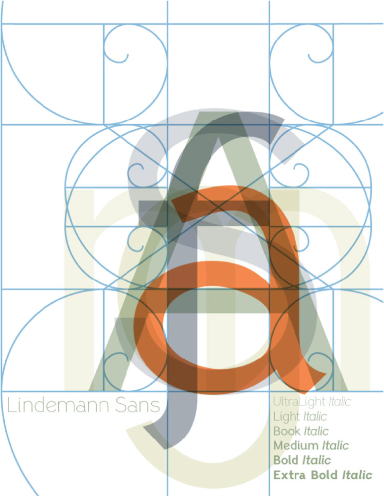
In early 2008, motivated by a self-imposed challenge, the first designs of Lindemann Sans were created. This endeavor started with the hope to create a geometric sans serif font with traditional ideals, but with a modern tech-savvy voice. The first month of the design was challenging due to the struggle with the unity of form. After reviewing my drafts, I decided that the structure needs to be the guiding framework. Once the structure was in place, I was inspired by the mathematical golden ratio and the Fibonacci Spiral. This mathematical logarithm appears everywhere in nature from leaves, flowers, pinecones, and most commonly nautilus shells. I then incorporated this natural spiral into my final versions of Lindemann Sans.
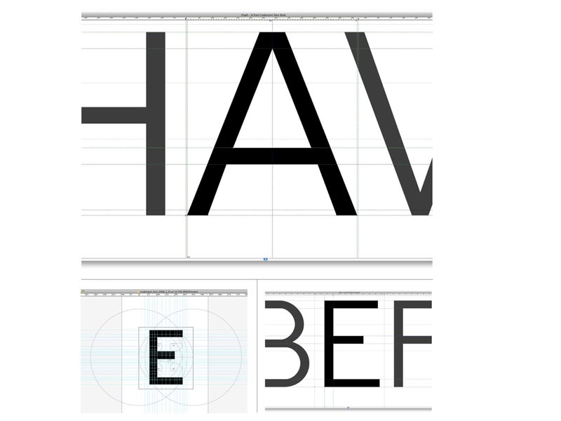
After choosing this spiral as the cornerstone of the design, the next step was to create a spiral matrix in Adobe Illustrator. This matrix was used in creating all 800 glyphs found within each font of Lindemann Sans. It was the skeletal structure for many design decisions, such as, the x-height being three spirals high, most glyphs being two large spirals wide, and the dissection of multiple spiral intersections to form the angles for many of the curves found within the typeface. An unintended surprise was how clearly Latin glyph shapes could be housed within this matrix and how the spirals themselves became inspiration for the curves found within the finished typeface. Also, many of the lowercase terminals, spurs, and tails were derived from the Fibonacci Spirals.
It did not become immediately apparent, but all design solutions can make new challenges. When creating Lindemann Sans, this challenge was between balancing personal aesthetics and the mathematical spiral matrix. Thanks must be given to Professor Josh Cross’s perspective that designing a typeface is no different than any other artistic venture. In addition, thanks to Professor Paul Burmeister for his daily encouragement and faith in my abilities. Paul never stated the obvious challenges facing designing a geometric sans typeface, but always gave words of wisdom and faith in my abilities to work through any challenges. He also shared his knowledge of how others solved issues of stem, stroke and crossbar weights within single glyphs. Next, the clear and confident direction, expertise, and advice from Panos Vassilliou was extremely helpful. His advice addressed the ink traps and black concentrations of joints within the lowercase glyphs, which were problems that could not be resolved with a spiral matrix, but only with creative artistic decision making. With thankfulness and thousands of hours of hard work, Lindemann Sans began to take its completed form with personality, a balanced geometry, and its own artistic voice that is highly legible.
Some aspects of the final version of Lindemann Sans that are the most appealing in retrospect are the inventive open form counter of letter a, the tails found on the letters f, i, and t, the slanted bar of letter e, the uniquely styled question mark and @ sign. These special glyphs and many more work as a family to create the specific voice of Lindemann Sans.
Finally, deep thanks must be given to my wife for her love, encouragement, and trust in my abilities. This trust was evident by her support of my thousands of hours of work and late nights after a full teaching day as a Professor at Wisconsin Lutheran College. To summarize I love type, I love the challenges of type designing, and I love creating something that others can use in their designs day after day. The most rewarding for me is to share my work with others, so enjoy and thank you.