We find ourselves excited by the future of the web, by the aesthetic pleasures of great web typography, by new gadgets for viewing mobile content, and by the increased bandwidth for media consumption. These exciting things demand responsive design, dynamically changing web content, and an almost exponential growth in knowledge and skill sets from us. However, measurement units used by web designers are not overly dynamic, relative, or responsive; rather, they are fixed to a dot size, default browser settings, or simple percentages.
Why is this an issue? Because of the ever-growing list of different browsers and devices for viewing web content. The most common solutions are to create multiple css files, make conditional alternatives for different browsers, or construct a plethora of @media steps within a single design. The end result is an ever-growing infrastructure that is hard to maintain. Perhaps a new unit of measurement is needed for a ratio driven responsive design? Not found in the newest iPad or mobile device pixel density, but instead, in nature, Greek architecture, and art history.
My background is in fine art, focusing on intaglio printmaking. In printmaking, you learn that removing variables and problem solving is critical in successful work. Something can go awry at any step along the way, but the joy of printmaking is its challenge, uncertainty, and the process. Web design is very similar due to the changeability of content and the uncertainty of browsers and hardware. One needs to master code, design, and aesthetics. All of these challenges can make any web design project overwhelming. I once received a piece of advice from a great printmaking professor I had in undergrad school. He said, “There are only three things you can do in any piece; add complexity, simplify, or incubate it and come back to it at a later time.” Nothing more, nothing less. It makes any job more manageable.
After some incubation and simplification of the need for a more ratio driven responsive unit of measurement, I drew up my notion using the golden ratio from antiquity. Starting with a 900 pixel width, I multiplied it with the golden number 0.618. This gave me the number 556. I then took 900 and subtracted 556 to get a width dimension of 344. After that, rinse and repeat.
It worked! So what is this magic number, 0.618? The golden ratio and the Fibonacci sequence are mathematical logarithm systems that appear commonly in nature from leaves, flowers, and nautilus shells. What makes the golden ratio so special is that by its nature it is responsive, dynamic, and aesthetically pleasing. The golden ratio works well small or large, making browser size and pixel densities almost a moot point.
However, using 0.618 for all design decisions isn’t that user friendly, and a calculator becomes necessary for all measurement needs. But, new dynamic stylesheet languages like LESS “which stands for Learner CSS,” makes the creating of new units of measurement possible; giving designers the power to create their own variable families, with the purpose of creating a full measurement system. My unit system “@gld” has a total of 10 options. The “@gld” system is based on a 1:0.618 ratio and similar to the Fibonacci numbers. This 10 unit system starts with @1gld being the smallest and @10gld the largest. Here is a visualization of the golden units and their responsive nature:
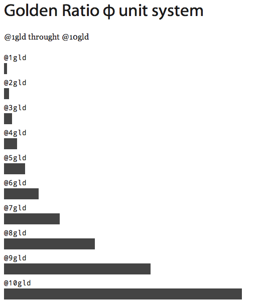
@golden: 0.6180339887498948482045868343656%;
@base: 100%;
@10gld: @base * @golden;
@9gld: @base - @10gld;
@8gld: @9gld * @golden;
@7gld: @9gld - @8gld;
@6gld: @7gld * @golden;
@5gld: @7gld - @6gld;
@4gld: @5gld * @golden;
@3gld: @5gld - @4gld;
@2gld: @3gld * @golden;
@1gld: @3gld - @2gld;
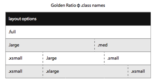
With this new unit of measurement in-place, large golden proportional block element classes can be created. Here are the class elements I created for page layout:
.full { width: @base }
.large { width: @10gld }
.xlarge { width: @base - (@7gld + @7gld) }
.med { width: @9gld }
.small { width: @8gld }
.xsmall { width: @7gld }
Example:
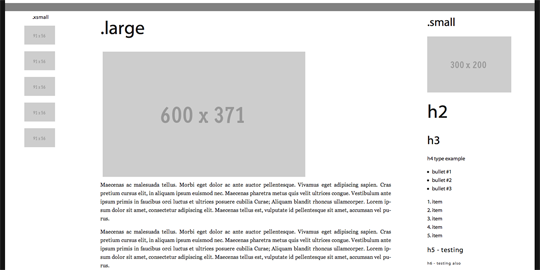
Application of this measurement system starts with declaring “@10gld”. This unit can be used for the width of a main HTML5. For example, if you have a wrapper of 1000 pixels you will have a main size of about 618 pixels. So all that you have to add to your HTML is class= “large” to make this work.
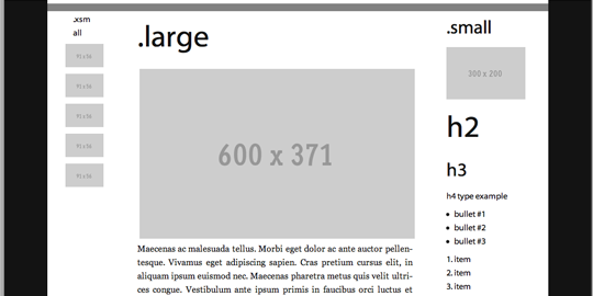
These golden ratio columns can become the skeletal structure for almost any web design, excluding thirty-three percentage, three column layouts or twenty-five percentage, four column layouts. After wire-framing, the golden ratio units can be used for anything including font-size, padding, margins, widths, image sizes, etc. You could design a site using only these units of measurement. Because LESS compiles to normal CSS all these “@gld” units gracefully scale to long percentages that even IE6 can understand.
The next example uses golden units for CSS padding. By default this padding is responsive and changes are based on the browser’s width.
Example of .med classes padding
.med {
    p, h1, h2, h3, h4, h5, h6, ol, ul, dl { padding: @2gld @5gld }
}
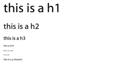
Typography size can also be declared in “@glds”. This will create font-sizes that work well together and scale appropriately for the content.
example for font-size code
h1 { font-size: @base * @5gld }
h2 { font-size: @base * @4gld }
h3 { font-size: @base * @3gld }
h4, dt, dd, li, p { font-size: @base }
h5 { font-size: @base  / @2gld }
h6 { font-size: @base  / @3gld }
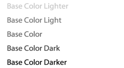
Colors can also be declared in “@glds”.
Example for monochromatic gray theme code
@baseColorLighter: lighten(@baseColor, @9gld);
@baseColorLight: lighten(@baseColor, @7gld);
@baseColor: gray;
@baseColorDark: darken(@baseColor, @7gld);
@baseColorDarker: darken(@baseColor, @9gld);
The golden unit of measurement system scales smoothly and embraces asymmetrical balance and a return to a more ancient design philosophy found in art history and nature.
Attached is a link to my GitHub repository for this golden unit design system.
GitHub: https://github.com/etchedprints/Responsive-Design-with-Golden-Ratio
Example: http://gld.chadlindemann.com
Thank you for allowing me to share my research with you.